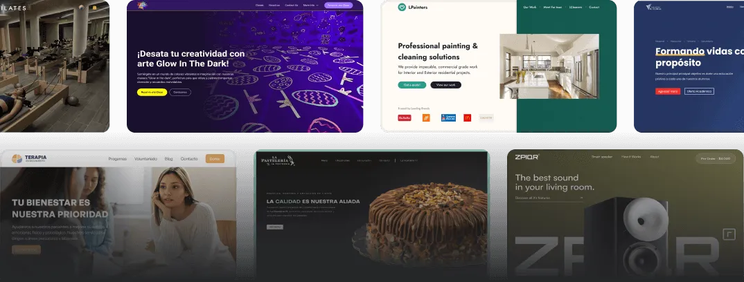
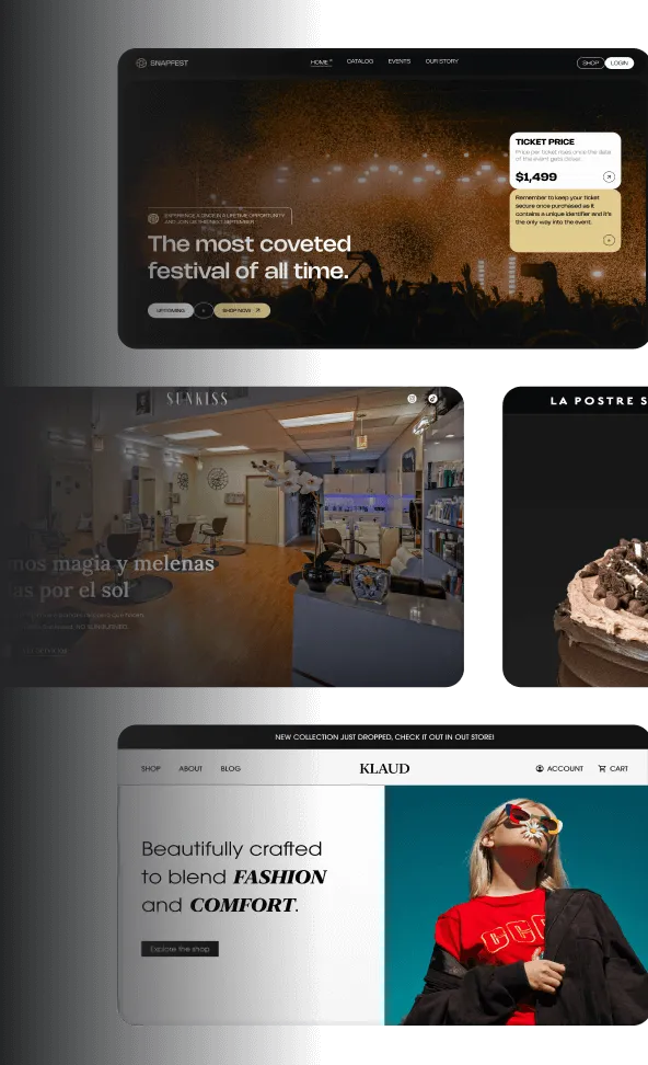
Color is a powerful tool in design, capable of evoking emotions, creating impact, and influencing user behavior. Understanding color theory is essential for anyone looking to enhance their brand and improve user experience. In this post, we’ll explore how the strategic use of color can generate contrast, evoke emotions, and provide examples of effective color applications.
The Impact of Color
Colors can significantly affect how users perceive your brand and interact with your content. Different colors can evoke specific feelings and associations, making it crucial to choose the right palette for your design. For example, blue often conveys trust and professionalism, while red can evoke excitement or urgency.
Contrast and Readability
One of the fundamental principles of color theory is contrast. Effective use of contrast helps draw attention to key elements in your design, such as calls to action or important information. High contrast between text and background colors improves readability, ensuring that your message is easily understood. For instance, dark text on a light background is typically more legible than light text on a light background.
Evoking Emotions
Colors can evoke a wide range of emotions, influencing how users feel about your brand. Here are a few examples of how colors can elicit specific emotional responses:
- Blue: Often associated with calmness and reliability, making it a popular choice for corporate brands.
- Green: Represents growth and harmony, frequently used by brands focused on sustainability and health.
- Yellow: Conveys optimism and energy, often used to attract attention and stimulate creativity.
- Purple: Associated with luxury and creativity, making it a favorite among brands targeting a high-end market.
By understanding these associations, you can choose colors that align with the emotions you want to evoke in your audience.
Examples of Effective Color Use
-
Airbnb: The use of a warm color palette creates a welcoming and friendly atmosphere, encouraging users to feel at home while browsing listings.
-
Spotify: The bold green and black color scheme stands out and reflects the brand’s energetic and youthful vibe, appealing to a younger audience.
-
Coca-Cola: The iconic red color is synonymous with excitement and happiness, effectively capturing attention and creating a sense of urgency in their marketing campaigns.
Conclusion
Understanding color theory and its impact on user perception is essential for effective design. By strategically using color to create contrast, evoke emotions, and enhance readability, you can significantly improve user experience and strengthen your brand identity. Take the time to analyze your color choices and consider how they align with the message you want to convey. Remember, the right colors can make all the difference in how your audience perceives and interacts with your brand.


